Monday, 20 January 2014

Props, Location and Setting (2)

 This shot shows the murderer holding a wrench and you can only see the bottom half of his body. This is a particularly effective shot a sthe main item in this shot is focused on the wrnech which is meant to be the murder weapon. The location is effective in a sense that you can see the darkness ahead, which could create the meaning that the murderer isn't going to find it difficult to find the woman again.


The weapon in this scene is the main object as it is hanging down beside him and he is slowly lifting the weapon up so he can move more freely with it. This might suggest that because he's a farmer, he has an experience on what he can use which isn't too heavy and he can still capture the woman once she has escaped.


This is the main weapon of our opening sequence. We are using the weapon as an inspiration from "The Shining" as we saw the scene of "Here's Johnny" and we thought the choice of weapon was useful for our opening sequence because its a weapon which can cause destruction.


This is one of the parts of the location we will be using. We saw this as effective because of the dark opening between the wall and the crate, and because it's a narrow path it would seem much more scary as it makes the audience wonder where the killer might be and they are prepared to be frightened.


Props, Location and Setting

In this particular photo, you can see that the farmhouse is very small, but we will have enough space to be able to create a torture scene. We are going to use low key lighting for the scene as it creates that sense of fear when the audience are watching it.
 
 This is another photo from the pictures of our location. this is slightly more to the left and it shows the room from a different angle. The room is quite spacious so this means that we can use the location to our advantage as their is enough space for equipment and other items.

 
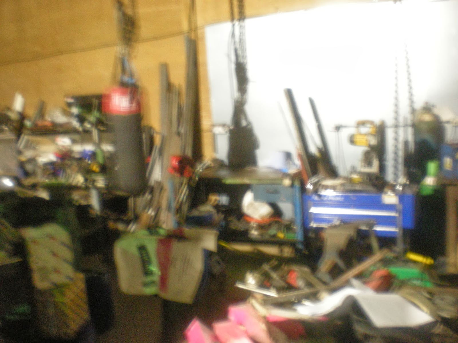
This is another angle from the farmhouse photo's. You can see that there is a lot of equipment which we can use to make the horror scene have our own distinct style. This photo creates a fuzzy style of our scene which could be effective as it creates a meaning of confusion and disorientation as there could be a hidden meaning behind it.

 In this photo you can see a variation of weapons and equipment which would be used by a farmer on a typical day to day basis. This is effective for our location as it shows a variety of props we can use for the murderer when he is slowly moving his hand above the weapons, deciding which one he is going to torture the girl with.
 

Wednesday, 15 January 2014

Target Audience

For our particular opening sequence, the certificate we are looking at is for people over the age of 15. The film is going to use inappropriate language which might not be suitable for younger ages.

The main reason of the age certificate being a 15 is because teenagers are more interested in watching horror films than an older age group, as they like getting a thrill from a horror movie.

This opening sequence we are making will have an effect on the perspectives of the audience because they might consider the possibilities of this happening in reality, which makes them feel uncomfortable when sitting in darkness or in a unfamiliar place.


This might affect them going to certain places, so for example, once they have watched our opening sequence when the killer is chasing the woman with an axe, this might frighten them if they next decide to go and visit a farmhouse later in the night.

 When we were thinking of choosing a location, it's normally best to think of a location which is isolated from any area so that the characters find it difficult to contact help.


When focusing on a target audience, there is six categories which all prefer certain types of genre's. These groups are: A - this consists of lawyers, doctors, scientists and well paid proffesionals, B - this is people who are fairly well paid and are either teachers or in middle management, C1 consists of bank clerks, nurses and junior management, C2 is the electricians, plumbers and carpenters, amd them D and E which is the manual workers and the unemployed. Each of these audiences have particular interests and expectation when watching a film of a certain genre.


Frames from "The Conjuring"

In this screen shot, you can see that the shelves are stacked with some unknown items and this makes the image look mysterious as the lighting is low and this normally resembles a horror scene which is about to occur. It could also suggest that the main villain in this horror film returns to this room after he has killed someone or attempted to murder them.


In this screen shot, you can see that there is a group of people who have all moved their hands forward into the middle of a table, like they are performing an exorcism to get rid of any possessed children or adults in the area they are situated in. This photo creates an unknown identity as the characters faces are cut out due to the lighting, even though the lighting is low, some of the characters faces are covered with light to make the audience wonder who the character is.

 The editing in this particular picture is effective as the characters faces have been cut out by the titles of the opening sequence. This makes the opening sequence effective as it suggests that the woman (Who hasn't had her face cut out) wanted to be isolated so in order to do so, she might of attacked or become possessed and the family were gradually split apart by either death or possession.


This screen shot is effective as the colours symbolise death and surrender, and the rope hanging from the tree suggests that someone is going to commit suicide or be killed in the film. The house is in the distance which creates a sense of mystery as the house is in the middle of nowhere, hidden behind some large trees.
 This is similar to the screen shot above, accept it doesn't display the title or show the rope hanging from the tree, so it directs your focus specifically on the house. The house looks like one which would be isolated so that you couldn't hear or scream for help, leaving you abandoned in a sense as they can't escape.

Wednesday, 8 January 2014

Analysing Fonts


In this blog, I will be analysing different types of fonts which are used in a horror film and how they are effective and create different meanings and thoughts that run through the audience.
 
This particular font (right) looks as if someone has cut out various letters from a newspaper to create some kind of code within the letters. This would frighten the audience as this is a very unusual font and it makes the audience wonder what is behind this.
 
Some of the letters are distorted and damaged in a sense, looking like they haven't been looked after and they have been left to slowly degrade over time. This could be a reference to the characters as these letters could be shown as similar to them in the sense of them being tortured in the future and this could be seen as a threatening message.
 
 
Addlethorpe 1

Chosen font

The font we have used for the title of our opening sequence is Heather BTN - Blackoak wide white 43. We saw this as the most effective as the colours in this title symbolise darkness and surrender, and the letters are very disorientated, creating something unusual within each letter. We can make a reference to our film opening sequence as the farmer has never been in the outside world and he is isolated from any life form except animals, so therefore he could of wrote this as he might find it difficult to write and read because he had never been educated.

Analsying film opening sequence formats


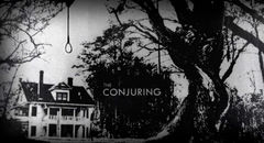
The Conjuring


The opening sequence format for "The Conjuring" uses basic fonts as a horror can seem frightening to the audience if it's too simplistic. The format compliments the background as the colours are black and white, and we see brighter and more vibrant colours less frequently in horror films. The colours black and white normally symbolise dark and negative thoughts. For example, black symbolises death or darkness, which will frighten the audience as they feel uncomfortable when they can't visualise things clearly or discuss death. White symbolises things such as surrender, which could create the feeling that the characters in this film are trapped and there is darkness surrounding them, and this could result in death as they don't know where to go or what to do, and there could be a paranormal presence or a killer in the same area.

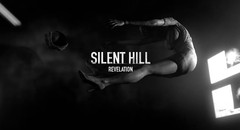
Silent Hill: Revelation 3D

The opening sequence format for "Silent Hill: Revelations" is quite similar to The Conjuring as they both use basic fonts and the colours are black and white. This is slightly different as the letters in this title look slightly blurred which could show disorientation. This could be a reference to each individual character as they could find thereselves lost at one point throught the film, and what I can suggest from the colours is that this could result in them being isolated and they begin to wonder where they are and they start to panic. The characters will end up doing something stupid while panicking which could result in the death of each character.